Cave Game Dev Log 1
It's October, which means it's time to continue my yearly tradition of making a game for Halloween1! I also remembered that the Ludum Dare jam coincided with the start of this Fall, so I'll just be continuing the game I made for that: "Beyond the Mouth of the Chasm". Although I'm not married to that name, so I'll just call this project "cave game" until divine inspiration says otherwise.
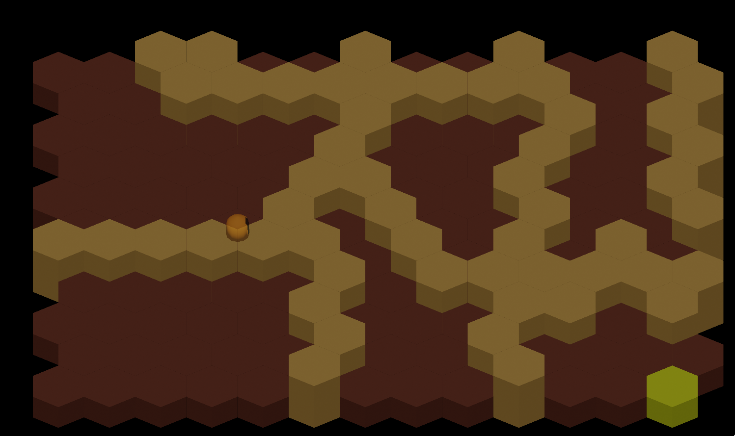
At the start of the jam, my idea was to create a 'colony sim' like Dwarf Fortress or Rimworld with a hex grid instead of square tile map or a continuous plane. Of course I tried to do too many fun things for the first time, like:
- Building a level editor
- Using pre-rendered 3D graphics in a 2D game
- Working with hex grids for the first time
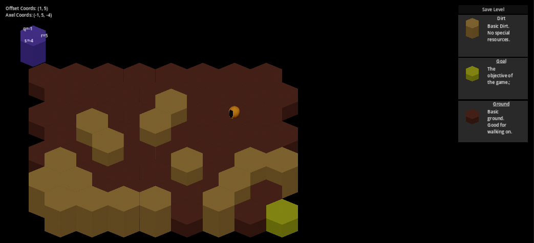
So I scoped down like a coward and shipped something simpler. You can order the little guy to mine hexes by clicking on them and once the path is clear to the 'goal tile' the game is over.
The game plan now is to release weekly development logs until I release the finished product this Halloween.
Dev Log
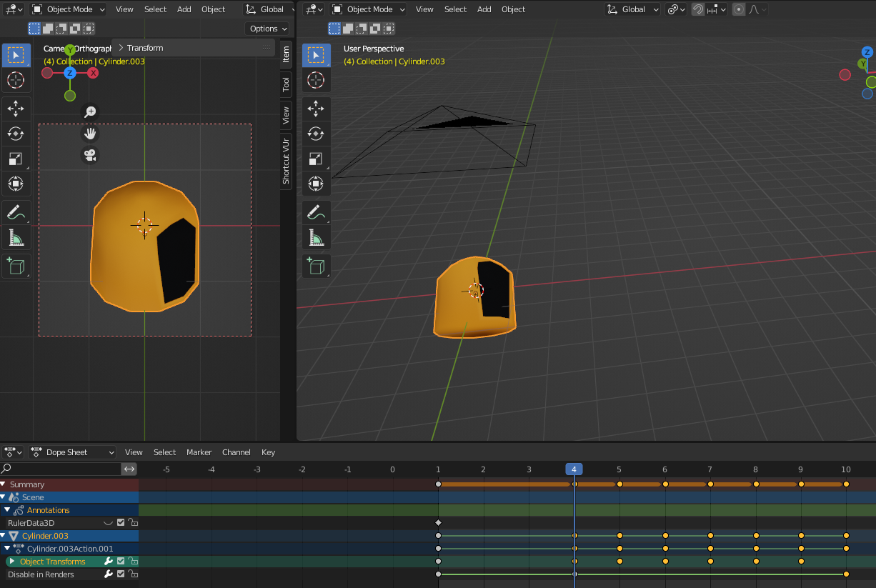
- Fixed The Occlusion problem by Y-sorting textures, Raising the absolute coordinate of two-unit high hexes, and shrinking the size of the player character
- Did a "paint over" in order to guide feature development
- Made a context UI for selecting actions
Occlusion
You may notice in that screenshot of the jam game that the player isn't occluded by the hex in front of it, this is because I was too scatterbrained to figure out how to get the textures rendering in the proper order, so I just made the character transparent: "it's a ghost, ooooouhuh, spooky!"
Despite all the sprites being rendered from 3D models, the game itself is actually 2D, so in order for object B to be in front of object A, it must be drawn after object A is already on the screen, thus overlapping it. In concept, this model is a lot simpler then casting rays into 3D space to see what the camera sees at any particular pixel, however it also means that we must come up with some way to manage this pseudo-3d perspective so that it appears a large hex will occlude the character behind it.
For doing this, there's a simple rule called "Y-Sorting" we can implement where we render textures in ascending order of how far down the screen they are:
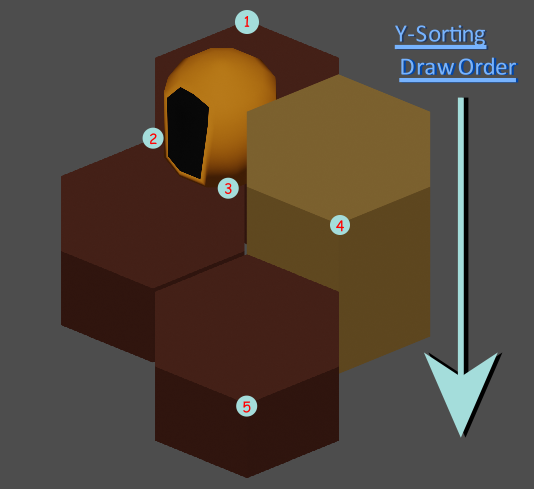
Notice that I've also shifted the larger hexes absolute position up a tad, while displacing it's sprite downward to compensate. This is so that there's a small margin for the player to pass through until the sprites overlap, at which point the player should always be drawn before the larger hex. more complex occlusion solutions are possible, such as treating multiple hexes as one texture and drawing a line across them for Y-sorting instead of using a single point, but I'll leave that for when it might be needed.
I've also shrunk the character since if you look closely you'll see that they should quite fit through the gap left by the hex, which was part of the reason the overlap was happening in the first place. This is part of the risk of faking 3D where you might make something that simply "doesn't work", but it's harder to realize since you don't see two meshes overlapping.
Paint Over
In order to have some idea on the direction I want to be headed, I did a quick paint over of a screenshot from the jam game.
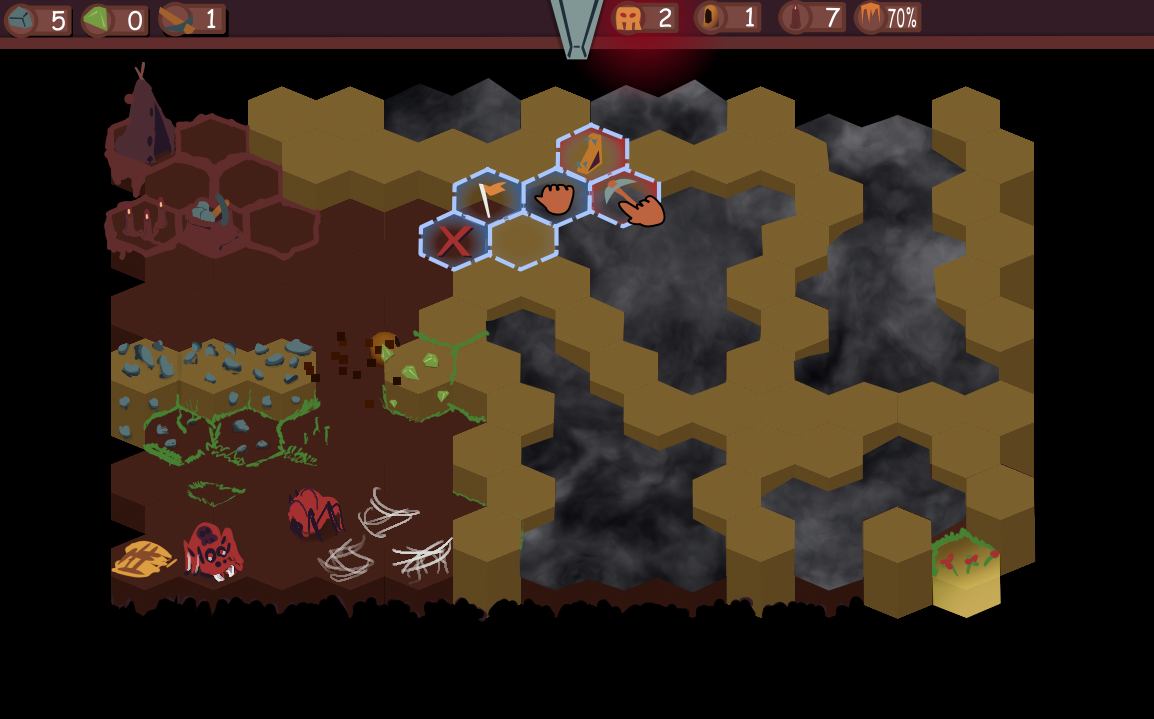
This has caused me to think about a lot of problems I'm going to have in the coming weeks, such as:
- How should I handle zones the player can't see?
- What kind of stats should be presented to the player?
- What kind of risks does the player need to balance?
- How does the player interact with the world?
Many of these questions are going to be down to experimentation, but I'd at least like to handle the "fog of war" issue by next week
The Context UI
Something I've noticed is that many games will have a zero to one hundred skill difference in UI. Either you know hot keys or you're fiddling about with menus to find the thing you need.
I believe long ago two games, Sacrifice and Black and White, gave us a compromise, context-sensitive gesture menus.
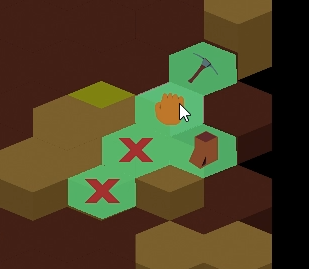
Visual enough that the novice can figure out what their doing and fast enough that the expert doesn't have to think about it, they just make the gesture and the deed is done.
Moving Forward
This next week I'm looking to complete
- A fog of war system
- Multiple agent assignments
- Resource gathering behaviors
- Initial stats UI
- 3D pipeline optimizations
Footnotes
- 1 2021 was Indoor Monster Farmer, 2022 was Bayou Fishing, and I never released the 2020 game, but it was a horror puzzle platformer so maybe that's for the best.